Friday, October 07, 2011

Green paintings


I've been told that paintings with lots of green in them are hard to sell. That very well may be true. To avoid making a green painting, I often leave green off my palette entirely but mix my own greens instead. This avoids having that green tube color dominate which everyone can recognize as a tube color. Mixing reds or sienna colors with greens helps. Also starting with a burnt sienna undertone in the painting will cut down that green look and warm the overall colors of the greens.

Wednesday, October 05, 2011

Insuring a center of interest


One way to insure that the center of interest stay as the focal point is to place the darkest darks next to the lightest lights.

Monday, October 03, 2011

Framing paintings for the web


When you see a framed painting on my website or newsletter, most likely it was not framed at all. It's difficult to photograph a framed painting because often the straight edge of a frame can be warped or curved because of the camera lens. Using a 50mm lens usually fixes that but in my case I have photographed a number of frames without paintings in them.

So I photograph frames that I like. I've even photographed frames in frame shops with the owners permission and it really doesn't matter at that point if they have paintings in them or not. I then adjustment those images of the frames in Photoshop to make them nice and rectangular and so on and from then on out, I have a ready stock of frames that I can then easily drop new paintings into.

The small and the big


It's very important to learn how to see the subtle nuances in the subject you're painting especially with colors and values and at the same time keep a major focus on the big shapes.
In this plein air painting I tried to keep my major shapes large while also trying to capture the subtle changes within those larger shapes. One of those subtleties was getting perspective lines in the sand that ran down towards the water.

Sunday, September 25, 2011

Working with color


I am frequently asked how I choose colors for a painting. It's possible to do a painting with any three very arbitrary colors. A full set of colors or even the primary colors aren't totally necessary.
Yesterday a friend was visiting the studio and the subject came up, so Sarah chose the three colors to the right and I was challenged to paint with these plus white.
Here is the result. (note: the board did have a burnt sienna ground to begin with)

Warning:
The blue oxide is a color that was on sale for practically nothing at an art store. I did use it on one of our PBS shows we did in the Caribbean as it was a good color for the water down there. I'd use caution with using such colors though. They are full of white and can generally be mixed with colors you already have. Mainly there is a danger with using these odd ball colors because you can quickly loose any harmony in your painting. They simply won't harmonize well with other colors.

Thursday, August 25, 2011

Overall tone


Keeping an overall tonal color to a painting is determined before the painting is started warm orange tone helped greatly to unify the entire painting.
Doing small paintings like this 5x7" piece also offers good practice in getting images, compositions and colors down quickly without investing lots of time. Do them, learn a few things and move on to another.


Monday, July 04, 2011

Duplicating Shapes

In general it is not a good idea to duplicate shapes throughout a painting but in this case it seems to work well. The triangle shapes of not only the mountain but all the fields help build a strong composition and gives the painting an almost abstract quality.
The painting was done in Flat Rock, N.C not far from our summer studio.


Sunday, July 03, 2011

Last Light

It was just about sunset and the light was fading fast. Sound familiar? Well, it always seems to be the case about painting outside. The light is always changing. In this case I had to deal with a warm light coming through the glass of this greenhouse from one side and a lot of reflected light directly from the sky overhead. Working fast forced me to analyze the colors and values quickly.
I never would have gotten these rich colors had I worked from a photograph. There really is nothing like painting on location to see colors. The painting may not turn out as good as the studio paintings but for learning about color, it can't be beat.

Sunday, June 26, 2011

Creating texture


In this painting I tried to create a lot of texture that represented the old fort here in St. Augustine. One way I did this was described in a DVD I did which partially dealt with the subject of creating texture easily and effectively.
To read a bit more about this you can go to this link and look at the bottom of the page for a program called "South Haven Lighthouse"

Beware of Post Office


This 8x16" painting was done on Masonite and purchased and sent to Canada. Masonite is pretty tough and I packaged it with several other pieces of heavy cardboard sandwiched between the painting. When it arrived in Canada, the painting had been broken in half. Fortunately the person who bought it let me replace the painting with another one. Insurance in my opinion for such a small painting is almost worthless since there are hoops to jump through to collect. My advice is pack things about double what you think they need. Sometimes the post office can be awfully rough.

Big eyes


This small portrait of a German Shepard was done on a 5x7" piece of Masonite. I had a thin wash of burnt sienna on the background as a base and this let all those warm colors of the dog come through the sketchy painting nicely. I pushed the cool colors of blue into the fury areas of the back coat so they wouldn't fight with the warmer colors in the foreground.
The cool colors under the dog made for a good balance putting all the focus on the animals face. I always make the eyes a bit larger in animals than they actually are. It gives them a much friendlier look.

Thursday, May 19, 2011

A palette for outdoors

I've been using a glass palette when I paint outside and my acrylics often dry very quickly in the sun. Here's a tip thanks to Jay Babina who sent me an email. She writes:

I was painting acrylic outside and was going through the usual spraying the pallet routine etc yet once the sun popped out, my mixtures were literally drying in minutes.

I investigated the stay wet pallets and tupperware pans etc too.

What I tried that worked out great is corrugated cardboard. I use a regular piece of glass as you do and just placed a wet piece of regular light brown corrugated cardboard on top of it. I wet both sides pretty good letting water run into the corrugations. It works great. It holds the moisture, doesn't designate or fall apart and best of all, it's free. A piece will last for hours or more with an occasional spray if needed - but nothing like glass where thin mixtures can dry in less than a minute on a sunny day. It actually traps water on the underside if on glass. When you're done, just throw it away. I know your pallet is fairly vertical in which case you may have to experiment with some tape etc.

Give it a try and see what you think.

Wednesday, March 16, 2011

East Point


Here is an example of an 11x14" painting that was done using only three colors. Alazarin Crimson, Indian Yellow, and Ultramarine Blue and of course white. This painting was done as a demonstration before a class and finished in about an hour not counting the time I took to sketch it out on the board.
The idea here was to create a mood expressing the rather warm but somber mood as this town of East Point, (near Appalachicola, Florida) is both charming and economically depressed.
By using only three colors the harmony within the painting remains stronger than had I introduced other tube colors such as green.

Wednesday, May 26, 2010

Poetry

Find something poetic in something that is ordinary. That is the job of the artist. Zero in on what you are interested in and what draws you to the subject to begin with. What are your feelings about what you are looking at? For me it's often something as simple as dappled sunlight falling across a wall. I try and keep my focus on that one thing which drew me to the subject and keep everything else subservient to that one thing.

Saturday, July 25, 2009

Getting proportions easier


This is a small 8x10"portrait of Sarah I did from a photograph. I was using my computer monitor to view the photo, zooming in to get the detail but I was really having trouble getting it right. Then I printed out a picture of her face the exact size as I was painting it. I placed it next to the painting and it was much easier to get the proportions correct.
In other words, having the photo the same size as my painting kept me from having to interpret and recalculate in my head the proportions and sizes on my painting. I could visually reproduce it much easier.

Thursday, July 23, 2009

Limited Palette


I use whatever colors I feel like at the time. I don't limit myself just for the sake of having a limited palette. However, most of the time I only use the primary colors to create a painting...

Cerulean blue and ultramarine blue and , - Indian yellow and cadmium yellow light, - Alizarin crimson and Napthol red (or cad red). This gives me both a warm and cool color for each primary color.

It's surprising how many variations including greens I can get from these few colors. I occasionally use black to gray my colors a bit. This also gives me one set of primary colors that are transparent and the other opaque. I start by using the transparent colors and then work into the opaque colors.

Monday, July 20, 2009

Mixing greens

During the summer months everything is so green. It often makes painting landscapes difficult because of the lack of variations with the color. When needing more variations with greens, it's often tempting to buy more green tube colors and use them get different hues. Most of the time adding more greens to the palette doesn't work very well. I find it best to keep my palette simple and mix most of my greens with blues and yellows often adding a touch of red to the mix. Adding more colors to the palette will more often than not simply make the painting less harmonious.
I usually start with a wash of of burnt sienna on the board, let it dry and then work my greens over that. It lets some warmth come through and dampens the harshness of the greens. Remember that all the greens in a scene like this will reflect and influence just about everything else like the rocks. A touch of green in all these other elements will give the painting unity.

Thursday, July 16, 2009

Three things I do consistently when creating a painting.
1. I work from dark to light.
2. I work from transparent colors to opaque colors.
3. I work from thin to thick.

Simple steps but it almost always gives me a better chance at achieving a good painting.

Thursday, June 25, 2009

A target audience

One very important way to maintain a presence on the internet is to target an audience. I have found that lighthouse paintings have provided me with a niche that can easily be googled as opposed to paintings I do in the mountains which have no real keyword. Hence, no one can really find my mountain paintings as the keyword is simply too broad. Most people that find my lighthouse paintings and prints do so because they are Googling a particular lighthouse such as Sullivan Island lighthouse so it's important to use the word "Sullivan Island" as much as possible in your description to help Google rank it.

Monday, November 24, 2008

Outsourcing

The outsourcing of American doesn't belong solely to the manufacturers of this country. It effects artists as well. Just go into most homes you'll find lithographs printed in China or Taiwan, or an "original" painting done from production line painters from these country's and that're pretty darn good at what they do. Certainly good enough for the average home buyer to consider especially when the cost is a few dollars compared to what good full time artists here in America need to charge in order to survive.
What artists are to do to compete is a big question.

Sunday, August 17, 2008

Art Olympics

What makes art centers think art is a competitive sport...that we should be interested in winning and taking home ribbons. Art is about being creative not about being competitive. Competition has its focus on "I'm better than you" and that sort of thinking destroys the art spirit and puts a business suit on the act of creativity.

Friday, July 11, 2008

Creating and performing a painting

When speaking about the arts, we tend to combine musician, dancer, and painter into that same general catagory of "the arts" but in many ways the painters path is different. A musician has a road map of written notes to play. How those notes are performed can make the musician great but it is not the same as being a painter. The painter in addition to "playing the notes" on canvas but must also be the composer on every work he or she creates. In the same way, the painter in addition to being the dancer must also be the coreographer for each new canvas.

This painting was done a long time ago from a photo I took in the Bowery- New York City.
I have often wondered where that man may be now.

Saturday, May 24, 2008

Why do you like that painting?

When people are asked, "Why do you like that painting?" I often hear the response, "Well, every time I look at it I see something different." (I'm talking about landscapes in general) The fact is most people don't really look at paintings. The mere statement tells me they didn't see the painting in the first place. It's a catch phrase they have heard before and simply repeat it. Most lack the ability and interest to see. There are many reasons people like paintings but it's not because they see new things each time. Some of those reasons are that it brings them to a place they associate with and love but the primary answer to the question is that beauty is enduring. Beauty lasts. It doesn't go away after one viewing.

Thursday, May 22, 2008

Inspiritation


People ask me where I get my inspiration. What inspiriation? I just go to work everyday. That's what it takes.

Sunday, May 11, 2008

Saving money on paint

If your concerned about the cost of paints here's a way to save some money. I wanted to use smaller tubes out in the field but all I had was a large tube and an almost empty small tube so I tried this and it works great. (You must have the soft plastic tubes and not the soft metal type tubes.) These plastic tubes will easily re-expand. Just hold the large and small paint tube tightly together and start squeezing the paint from one to the other. You might think paint will squirt out the sides but if done carefully it's not a problem. Try it!

Sunday, March 16, 2008

Less is More

The idea of less being more fits well into the theory of painting. The power, beauty, and strength of statement can be greater when the picture is stated simply and not overdone. Holding back is important in painting. Here's an anology. A legal document drawn up by laywers says everything there is to say about a subject in precise detail but most often will not convey much in the way of meaning to most people. The same is true of painting. Put in every detail and you'll loose the importance of the big statment...the very thing that attracted you to the subject in the first place only to get caught up in the smaller but less important details.


Saturday, March 15, 2008

Photography and Painting

Photography is like stabbing with a knife but painting is like meditation. I don't remember where I heard that but it struck a chord. I have been involved with cameras and photography all my life and I realize what it takes to make a good photograph but it doesn't compare with having to carefully work every inch of a painting with consideration on every brush stroke.

Thursday, March 06, 2008

Picture taking vs painting pictures

Photography is liking stabbing with a knife whereas painting is like meditation. I'm not sure who said that but it sure struck a chord with me.

Monday, January 28, 2008

Two elements of painting

There are two elements involved in making a painting. Observation and interpretation. Artists must be able to see clearly and remove all preconceived ideas as to what objects look like. For instance, the idea that tree trunks are brown must be put aside and the study of their real colors which are many and varied must be more closely. Then the process of interpretation comes into play. It is what makes the painter different from the casual photographer. The painter gets to choose what he or she wants to focus on in a way a photographer can not. The painter can achieve the essence of the subject by not only concentrating on that part of the painting but also by leaving other details out or leaving them to the imagination. Interpretation can breathe life into a painting and make it personal.

Saturday, December 29, 2007

Art or not?

If you ever wonder why certain paintings or sculptures are considered art, be aware the context the piece is viewed in puts a lot of weight on whether it is consider art. Just because a museum has a show of aluminum lawn chairs from WalMart in an impressive white room with wood floor and track lighting doesn't make them art. Much of what museums display is nothing more than art polution.

Tuesday, November 27, 2007

Spray Gesso

If you paint on Masonite and love a smooth painting surface, Krylon makes a spray Gesso. I bought a can to try it out and it works great. It's expensive but convenient and puts down a great surface on which to paint especially for smaller paintings.

Monday, November 26, 2007

Elements to a sucessful painting

A good painting has two elements that make it interesting and powerful.

1. The subject must be deeply felt by the artist. That doesn't mean that you have to love barns in order to make a great painting of a barn. It means the artist must be moved by some element that is the focus. It could be the way the light falls across the old boards for example. If the artist doesn't feel it, the viewer certainly won't either.
2. The subject has to be stated simply. Again, that doesn't mean there can't be lots of detail in a painting. It means the subject itself must be clearly stated. There should be no competition in the painting that detracts from the intended purpose. No unnecessary frills. Frills will not help a painting where there is no primary focus to begin with.

Wednesday, October 17, 2007

Feeling the subject


More often than not, a subject that reaches me most deeply is very simple. Seeing the commonplace and having profound and deep heartfelt feelings about it is what keeps artists alive. When the artist feels it, then the viewer can also. If the artist lacks feelings about a subject, then certainly the viewing public won't feel anything of value either.
If you don't feel the subject, don't paint it or you'll be wasting your efforts.
(click image to view larger)

Painting is Language

Painting is a language no less than any written language. To think that one can through inspiration and talent can create something of worth is to think that one can write a novel without knowing the language or how to spell. I think the reason is that so many mediocre paintings exist they have become the norm. People hardly know good art from bad.
In order to create a painting with meaning you must the fundementals that make up the basic language and those things are drawing, perspective, color, composition, etc. and that takes a long and dedicated effort.
No one thinks a person could possibly play wonderful music on the violin without first knowing the scales. Painting is one of those hard earned skills that many think can just be done with talent alone. It cannot.

Sunday, July 08, 2007

Painting Quickly

I find it very hard to understand why art customers are so interested in asking how long it took to finish a painting. I paint quite quickly but it seems to be a negative if they know how "seemingly" easily they were completed. If a fine guitarist plays with great speed, people applaud their agility. Why is it so different with an artist if the results of the painting are of quality?

Thursday, June 21, 2007

Looking but not seeing

I'm not a Bible scholar, (my wife and I are Baha'i's) but there is a verse that says something like, "you hear but do not understand, you look but do not see." It got me thinking about how that relates to painting. We all know how difficult it is at times to understand driving directions, how to accomplish some task in a new computer program and so on. We accept that fact quite readily. However, we have been brought up to think that "seeing is believing" but it is not the case at all. Seeing a landscape is a very tricky situation and for an artist to paint a good landscape, he or she must be able to see in ways that others do not. The artist must have a keen ability to detect subtle changes in color, form, values, and edges and put them all together selectively to convey the essence of the subject. No easy task and one that takes years of constant attention.

Wednesday, June 20, 2007

Eyes versus photographs

I rely on photographs for reference while in my studio painting but I often have to remind myself what the camera sees and what the eye sees in the outdoors are very different. The camera averages the exposure of a landscape and in so doing, the sky may be washed out in order to keep the trees from looking too dark. Another problem with photos is that it looks at the entire picture at once. The eye look and focus on small areas and will adjust itself to see into that area. For instance, I might look at the shadow under a tree and my eye will dialate to see the detail there. A photograph won't do that because it sees and exposes for the entire scene. Our eyes move around and quickly expose themselves to small areas giving us a clearer picture and more information that a photograph can produce.
One photographic solution is to shoot multiple exposures of the same scene or use photoshop to create several different exposures of the same photo in order to see more clearly into those areas which are too dark or too light. That of course will also leave some parts of the photo overexposed and others underexposed leaving the artist to put it all back together with it's appropriate real life values.

Wednesday, June 13, 2007

Mood versus detail


The mood of a painting is more important and expresses the essence of the subject far more than the factual details.
Harmony was easily achieved because by having just these few colors, every color that was mixed simply couldn't go far off track.
This landscape was also painted by just using three colors. Alizarin Crimson, Ultramarine Blue, and Indian Yellow.
(click on painting to enlarge)

Wednesday, June 06, 2007

Using only three colors

This painting was created using just three colors. Alizarin Crimson, Ultramarine Blue, and Indian Yellow (and of course white) These are transparent colors. Colors such as cerulean blue, cadium yellow, or cadium red are opaque colors and will not give me the deep dark colors like the transparent colors will. It's amazing how much variation can be accomplished with the use of such a limited palette. Try it sometime. The other advantage is by using just those three colors, your painting will always be harmonious.
(click on painting to enlarge)

A Refuge

A friend and I were talking about the value of painting and sometimes I question that value but he said, for him painting can be a refuge. I never thought of it that way before, a refuge from what troubles you and from the unsolvable problems of the world and community. I liked this idea as it shifts the purpose of painting from that of producing a result to one of inner peace.

Friday, June 01, 2007

Art Teachers

When you are looking for a good teacher, remember that good artists don't always make good teachers and I have seen the opposite as well where very good art teachers are very poor painters.

Friday, May 04, 2007

New type of brush

A friend loaned me a set of these new brushes called Aqualon Wisps to try. They are suppose to be good for painting grass, beards, etc. Well, an old worn brush or the standard fan brush will do just as well, maybe better.

Thursday, May 03, 2007

Interior Decorators

Last evening I was attending an event at a very exclusive condominium. The furniture and carpet was shades of pinks and purples. On the wall was some of the worst artwork I have ever laid my eyes on. But guess what! It perfectly matched the colors in the furniture and carpet. Personally in all the decades I have been painting, I have never once dealt with an interior decorator interested in actual artwork. I'm not offended by this when they visit my studio with a client but I'm aware of their focus which was so evident last night.
What does offend me is after seeing nothing more in a painting than a match to their color swatches, they reduce 40 years of intensive study to create a painting with substance by further expecting the artist to hand them a 50% discount. Artists and their art are nothing more than a commodity to decorators. I hope someday one of them will prove me wrong.

Quick exposure

Most digital cameras today auto focus and auto expose when the shutter button is pushed down slightly just before the picture is snapped. This often leaves you with a photograph that is either too light or too dark. I make a habit of pushing the button down slightly and giving the picture a quick look while still aimed at the subject. If the picture seems too light, I release the button, point the camera into an even brighter area where there is more sun and again push the shutter partway down. Then I swing camera back to where it was originally and the resulting photo will be darker.
Conversely, if the photo seems too dark, swing the camera into an area that is even darker, press the shutter slightly to expose for that darker area and while still holding down the shutter slightly in order to preserve that exposure, swing the camera back into position and your picture you want will be lighter.

Wednesday, May 02, 2007

More about Seeing

"A landscape has got to mean a great deal to anyone before it can be painted in any worth-while way. It is harder to see a landscape than to paint it. This is true because there are lots of clever people who can paint anything, but lacking the seeing power, paint nothing worthwhile."
Robert Henri - Ashcan school

Friday, April 27, 2007

Brush strokes tell a story

Brush strokes tell much about the artist who created them. Bold, soft, reckless, and so on but many strokes describe artists that are unsure of themselves. Even to an untrained eye, these strokes will kill a painting. The fear of painting shows in every stroke and defeats the entire reason for painting but I have seen it happen many times. It is a fear that has to be overcome.

Saturday, March 17, 2007

Exposures


When working on paintings from my digital photographs, I often take the photo, make a copy and overexpose it. The original picture I adjust to give me the best visual look of the photograph in general with nice rich darks tones. The copy is then overexposed allowing me to see important details in the dark areas that aren't visible in the first photo. The second picture makes a poor photograph but often gives me clues to details I otherwise would totally miss in the first photo.
note: you can click any of these photos to see them larger.

Monday, March 05, 2007

Making Thick Textures

If you want to create thick textures on your canvas, use Modeling Paste. It's basically marble dust in a medium that is about the consistency of heavy cake frosting. If you know where you want your texture to be, brush it on your canvas then let it dry before you begin painting or you can mix it directly with your paints. It doesn't seem to diminish the intensity of your colors like white paint would unless you use a lot of it. I seldom use it but there are times when it comes in handy. I have paintings I used it on 20 years ago and it still looks as good as the day I applied it. It's not a substitute for using white paint though. If you want a textured white background, either mix white with it or paint white over it. The brand I've been using is Liquitex Modeling Paste.
Watch a video on stretching canvas and using modeling paste.

Friday, March 02, 2007

Thirds

Breaking down the composition of my paintings into thirds is a guideline I follow almost instinctively. Here's an example. Had the lighthouse been in the center and the horizon in the middle, this painting would not be nearly as interesting. Since I feature the rocks instead of the sky, the horizon was painted high on the painting. If I was going to feature some clouds I would have moved my horizon line to the lower third of the canvas. It doesn't always hold true but it's a good guideline to be aware of when composing your painting or photograph.
View more of my lighthouse paintings

Give til it hurts.

Like every other artist, I recieve cordial invitations weekly to donate artwork to good causes so they can auction it off at a fraction of what I would otherwise charge. Today I got the best letter I've received in months. It stated, "Would you want your artwork featured, along with a Peter Max original, during the art, wine, and food fest?"
That's like asking me if I want my piece of art I took possibly a week to create totally upstaged by mega-media-whore Peter Max. What are these people thinking! I've seen Peter Max in action and his "people" (Public Relation handlers) don't like any other artists near him in fear of getting to close to his spotlight when the media is present (not that we'd want to or could) and they ask the media not to video him from behind because he doesn't like his public to notice his bald spot. Geez! When are these local beggers of art going promote in earnest the artists in their own community instead of using us as a side show for their featured act?

Friday, February 16, 2007

Fame

If you're a young artist with dreams of becoming famous, (like I once was) know that fame comes by being connected and not necessarily by being a good artist. As you get older, the dreams of fame become less important but the passion for painting can remain a strong and powerful force in your life. One that will be much more fulfilling than fame.

Tuesday, January 23, 2007

Coating your paintings

I have used a number of sprays to coat my acrylic paintings. For several years I've used Krylon Crystal Clear and have a friend who's been using it for a decade. I buy it at Kmart for $2.95 a can. The Golden varnish was purchased at an art store. It cost $17.99. I wouldn't use Krylon just to save money at the expense of good results but in my opinion it does as good or better job than the expensive stuff.

Pure White

I seldom use pure white in my paintings. Using a bit of yellow or yellow ochre in my white will give it a life that pure white lacks. If the painting calls for a cool white, I add a little cerulean blue to it.

Sunday, January 21, 2007

Composing in the camera

When I take photographs, I try to compose my subjects the best I can in the lens then back in the studio, half the difficulty in painting has been resolved. I find it much better than struggling to rearrange a composition that wasn't quite right in the photo. With a good photograph I'll more likely end up with a good painting.

I sometimes capture a still image from my video cameras as well. I've been able to capture images that are quite suffecient to use as reference.

Using your monitor

Try using your monitor placed near your easel or drawing board to view your reference photos. It's much better than a print out and with many viewing programs (I use ACDsee) you can zoom in your subject to see the details.

Sunday, January 14, 2007

Looking at things differently

Artists may see things more clearly than others but only in certain respects. An artist looks at a sailboat and sees how the water reflects up on the hull or how the sails catch the light and shadows. The yachtsman sees the same boat and sees none of those things but may observe how well the hull is cutting or dragging through the waves and how the sails are trimmed.
We are all blind to those things that do not interest us.

Perspective and Clouds


Often artist don't think about clouds in relation to perspective and although clouds sometimes seem random, they too follow rules. While at the port in Tampa today I took this photo which shows their perspective. Not all formations will be so obvious but a perspective always exists. Often it is most noticeable closer to the horizon.

Tuesday, January 09, 2007

Reflections in Water


Here is a rule that comes in handy when painting reflections on the water. Light objects reflect darker and dark objects make a reflection that is lighter. As you can see from this photo, the white boat casts a darker reflection in the water and the dark motor reflects lighter in the water. Don't ask me why but its always that way.
I have made an 11 minute video on the subject of waves and water. Click here
You can see a list of my other videos HERE.

Friday, January 05, 2007

Pitfalls of using photographs by others

The painting (above) was done using photograhs that I didn't take. I seldom resort to that but occassionally there is no option but doing so poses certain problems. Not because of a lawsuit as my painting ends up far from being close to the photograph. The problem comes with lack of information even with a good photo seems to provide. Here is an example.
The first picture (below) shows the rocks but gave me no indication of where they jutted in and out. I assumed they didn't have much direction at all. I started the painting using the first photo and then found this second photo which defined the crevises with light and shadow more clearly. Had I actually been at the lighthouse (wish I could) even for a minute I would have grasped and understood the topography that the first photo simply didn't express.
So, even if you work from photographs, doing so from your own photos will result in a much clearer undertsanding of what you are trying to portray. It only takes a moment for those important features to stick in your mind when you take your own pictures.

Keeping your acrylics from drying out


As I'm sure you know, acrylics dry quickly. Sometimes too quickly. Your half hour break for lunch will find a palette full of unusable dry paint when you return. A simple box (I built mine with a clear acrylic top) will keep your paints wet even overnight. Just give the top of the lid as well as the paints a squirt of water from a spray bottle when covering your paints.

Another commercial method to keep paints wet is to purchase "Masterson's Sta-Wet Palette". With this you use the wet sponge and a special paper palette. It will keep acrylic paints very wet for many days.

Thursday, January 04, 2007

More than paint on canvas


Painting a landscape is not about putting paint on canvas, it is the process of continually and attentively absorbing the visual world with a caring eye in a way that others take for granted.

Friday, December 29, 2006

See more, express less

A good artist will see more and express less. Therein lies the power of a good painting. A complex landscape in the country has thousands of elements to consider; trees, limbs, leaves, grass, clouds, shadows, colors, values, and on and on. The artist takes this myriad of overwhelming information and expresses it clearly in simple terms so it can be more fully grasped in its essence.

Web sites and your artwork


The only way I know to sell your paintings or prints on the internet is to have a niche market for your work. I paint many different subjects. In the summer when I'm in my studio in the North Carolina I do landscapes of the Blue Ridge mountains, barns, etc. The problem is that no one knows how to look for such a thing on the web because it's such a broad subject. Now if I were to feature paintings of Mount Mitchell and someone was trying to find a painting of Mount Mitchell, then a search would be able to find my niche. Otherwise it's lost in a sea of general ties.
I've done two books on lighthouses and just by accident, I found a niche market for lighthouse prints. The important thing to know is that people who order lighthouse prints are not interested in buying a print of a lighthouse. They are interested in buying a print of a particular lighthouse because it has personal meaning to them. Any lighthouse won't do. On my website www.bansemer.com I feature lighthouses and when someone is looking for a print of the "Morris Island Lighthouse", well, I just happen to have it and it's easy to find. It's the only way I know of so far to be successful on the web. I suppose there might be a niche for "fantasy lighthouses" as well. In any case, generalities don't work well if you are trying to promote your work. Be specific.
(Pictured is a painting I did of the Brandt Point lighthouse in Nantucket)

Hesitation makes for weak paintings

You can be sure that a painting that inspires us was done by an artist sure of him/herself and not one that hesitates. Most good paintings display brushstrokes that are deliberate, strong, and know where they are going. It is a very difficult thing to do. Study those who have mastered it and see how much they convey in a powerful and well placed stroke.

Wednesday, November 29, 2006

Seascape Painting


The painting of most subjects can be learned by looking at subject itself. One exception is the painting of seascapes. That can often be learned best by looking at someones work who paints seascapes well rather than sitting and looking at real waves crashing on the beach.

Getting Results

Don't be overly concerned with the results of your painting. After all, it is just paint on canvas. Move on to the next one and the mistakes you have made combined with what you have learned making those mistakes will serve to make your next work a little better. Laboring over a painting by trying push it to the point you know you would like to see it is often a futile excercise and can worsen your final results. We all have limits from which we cannot exceed. If you have a general idea where those limits are and not beat yourself up over not reaching them every time, your progress will be natural and steady.

Tuesday, November 28, 2006

Playing up the Important


When everything is bright, then nothing is bright. If you want something to demand attention, make whatever is around it less important like the background behind this small flower painting.

Field Studies

I have seen artists paint on location and use it as reference for a larger more finished work to be done at their studio and tell others how important that procedure is. I have never been able to grasp that concept. When I paint outside, I am never able to finish the painting on location and I never use it as reference to do a larger piece. After painting outside, I finish a painting in the studio and leave it at that, then I have a nicely finished small painting to show rather than leaving it as a study. To create a larger painting I need more information than I'm able to glean during the half hour I painted outside. The idea of painting less and making more of it later just doesn't work for me. My field paintings are simplified and basic and seldom can I transfer that to a larger piece. It doesn't mean that plein air painting is of no value. The soul of the subject can often be felt while in the field as opposed to being in the studio. That information can be mindfully stored and often comes out naturally in future paintings. I require information to complete a larger painting and I use a camera to capture the details I need for a large work, not just a small field study.

Monday, November 27, 2006

Thoughts on Essence

All my life I have heard artists say that they want to capture the essence of the subject. It is one of those phrases that sounds good and makes the artist feel like they have insights into things that others don't.
So, I've been thinking about it lately (now that I'm nearing my late 50's) and I have on occassion captured the essence of my subject. When it happens I know it but it wasn't something I could force. The more times it has happened, the closer I have become to knowing what it means to me.
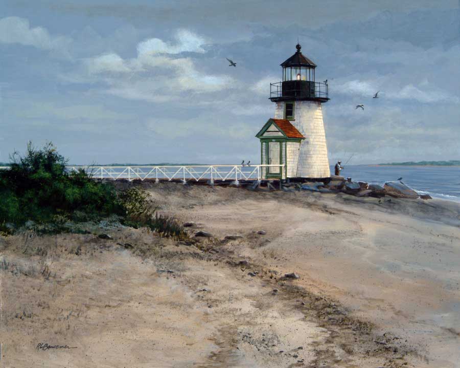
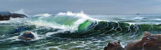
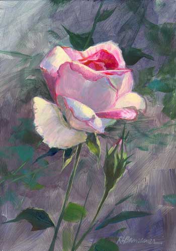
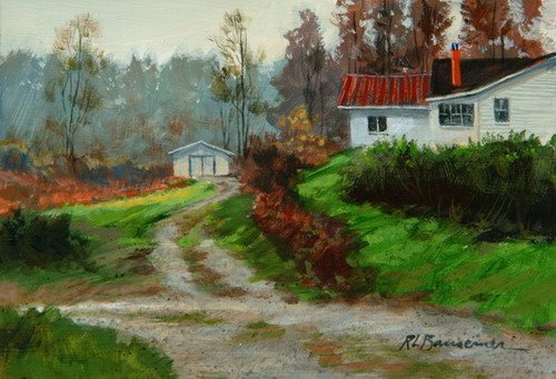
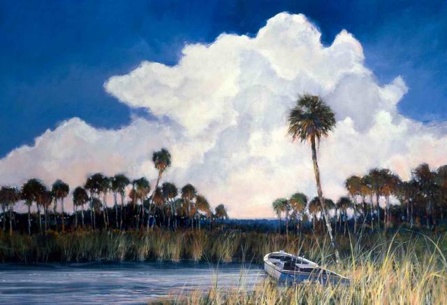
Artists must pick and choose what they want to focus on in a painting. Whatever that is becomes the center of interest. all else becomes subservient and takes on a suporting role. It is the difference between a painting and a photograph. The camera, at leasts for most of us, can't capture the essence as it sees all things equally. A good artist, however, transforms the landscape into important and unimportant features that all work together. Those who paint every blade of grass thinking they are capturing nature cannot possibly capture the essence of the subject. It may take lots of time but takes little skill to paint every detail equally. Essence is achieved when one captures an entire field of grass with a few strokes of the brush and gets the feeling of vastness, richness, depth, and light. If those few strokes convey those things they have captured the essence of the subject. Essence is the ability to take the complex, reduce it to the minimum but within that minimum reveal more than the combination of all those blades of grass put together.

Tuesday, November 21, 2006

Connections

You can know everything there is about painting and still not know how to paint. There is a link between your head and heart and your hand. Those elements must be closely connected. All your knowledge of painting has to be transferred from your knowledge and emotions to your hand and brush. That almost mystical communication just comes with time and cannot be accomplished by intellect alone no matter whether your a plumber, doctor, or an artist.

Learning Curve

I have found that my ability in painting does not increase in an upward curve. Rather it runs in a straight line for months at a time, sometimes longer and then suddenly jumps to the next level quite by surprise. For me, reaching the next step on the ladder comes not by trying to hurry to that next wrung but instead by slowly and steadily working my way upward. Trying to force it often will cause frustration and possibly a fall. I enjoy the level I'm at, enjoy the moment and when I reach another step, it becomes an unexpected and rewarding experience. Once that next level is reached it will always be with you.

Complexity


The complexity in nature is overwhelming when looking at a subject weather it be a landscape, seascape, portrait, or whatever it may be but the beauty and joy of painting is taking that vast amount of complexity and reducing it to a few simple brush strokes. That is what is meant by capturing the essence of the subject and it's a true joy when this can be accomplished.

Saturday, November 11, 2006

Kitchen counters

Artists need to know that a Corian kitchen counter is more important than an original piece of art for all but a very small fraction of homeowners.

Saturday, November 04, 2006

George Inness

American Landscape Painter George Inness (1825-1894) wrote: "A work of art must have subtlety of tone and a certain amount of mystery that can never be seen at first glance. It must be looked at a long time before its subtle tones can be grasped; and if it is great, it grows upon you, and the longer you look, the more you see, and to describe it is almost impossible, because you never see it twice a like. It changes with your mood. It is a thing to live with. You study it; you learn to see the soul of it. It is like a face that becomes beautiful because you have learned to know and love the soul behind it. When a picture gives you this effect, it is great art."
What a beautiful statement!

Be Skeptical

A landscape painting can make such a beautiful and powerful statement on its own without entering that realm of opinions and personal points of view. Be skeptical of "truths" when it comes to rights and wrongs of art. Find that truth in looking at nature.

Looking at Art

Looking at artwork that is not up to your standards or not as good as you can produce yourself is generally a waste of time. It can force you to find merit in work that you may otherwise just overlook but other than that, time is better spent looking at nature. When I visit to a gallery I want to leave saying to myself, "Wow, I wish I could paint like that." If that doesn't happen nothing much has been accomplished.

Friday, November 03, 2006

Our Slogan Is....

There are election posters littering the streets when I wrote this and one large sign had a photo of the smiling candidate along with the slogan "We Can Do It". A simple minded slogan and apparently a platform with no meaning whatsoever. Well, in painting the public is "sold" the same thing, trite pictures with no meaning or substance by heavily promoted artists producing primarily for the salability. It seems to be the easy way to go and pleases everyone. Eye candy with no meat. Don't think that anything short of giving your paintings as much meaning and thought as possible will give you any lasting satisfaction. Your paintings need a real platform that speak more than mere slogan. Don't paint pretty pictures for the sake of painting a pretty picture.

Wednesday, November 01, 2006

Painting Demonstrations

I have been making some painting demonstration videos and immensly enjoy the process and especially being able to share them online. As to the value of such programs, I wonder if watching someone paint is like thinking you are going to read by listening to someone reading. You may be inspired, motivated, and learn helpful tips but it's doubtful if you will learn to paint. I could be wrong.
If you are interested in watching any of my videos on painting and other short subjects you can find them on my video page.

Thursday, October 19, 2006

Donated Artwork

I have dontated countless pieces of my work to causes that seem to call on a weekly basis. But art has become nothing more than cheap entertainment for these fund raising events and lead you to believe that there is something of culture involved with the event. I have never attending one of these benefits where the art and artists were anything more than a side show for what are basically networking sessions for upwardly mobile socialites where wine and ordurves take center stage above all else. Artists know this and artwork donated is usually of second quality because of it. The promises of promotors that the artist will "get a lot of publicity" is just not true. I've been hearing it for more than forty years. If anything it may take hurt the artist by fulfilling the desire for a potential customer to own a piece of art. The artist may well be donating himself out of a potential customer.
I'm not against raising money for good causes and I still donate to most of them that come calling but the artist doesn't deserved being reduced to a Side Show Bob where wine is being spilled over the table next to the artwork and that case of oil that was donated by AutoZone. Donating art is not like giving something for auction that is manufactured. The artist puts down every stroke to the best of his or her ability and that takes time. More than that, the artist whether good or bad, tries to speak through his or her art and most of these events and auctions totally drown out everything the art has to say.

Wednesday, October 18, 2006

An honored place for something you wouldn't really want.

I have often wondered why people will hang a painting in a prominent place in their home depicting something they consider unsightly when viewed in real life and would find objectionable if it were on their own property or in their neighbors yard. For instance a rusted tractor or a beat up shrimp boat; not something you want next door. We put these images in a place of honor in the home but choose only to be associated with them from afar. Art often reaches people in ways that real life cannot.

Sunday, October 15, 2006

Art Centers

Thre are some very good art centers in the country, especially the ones in small towns but often art centers and art councils become organizations that are primarily concerned with keeping and maintaining their own jobs. They become less interested in the artists and more focused on fund raising, patrons, social activities, and place the artist at the very lowest end of concern. This is made most evident by art centers that ask artists to donate art for their fundraising activities and never consider giving back a percentage of the proceeds to the artist. In my opinion, art centers should serve the artist at least as much as the public.

Finishing a Painting

Finishing a painting, especially a larger one, is never like finishing a race and coming in first. It just doesn't comes with that sort of exhiliration. It's more like running out of gas.

Friday, October 13, 2006

A Comfortable Formula

Don't fall into the trap of using a formula. I know of several painters that find one subject and have found some success in it both financially and with public approval but their paintings have become stale and predictible. Their paintings lack insight, life, and the esscence of what they were originally in search of. They have become comfortable and in so doing take on the role of a commercial artists whose purpose is to please others and not themselves. They stop growing as artists when that happens. Know your limits but never be satisfied with them.

Inspiration

Dedicated artists do not wait for inspiration. They get down to work much like anyone with a job. Inspiration is a bonus an artist will occassionally recieve. When it happens be grateful and take full advantage of it.

Wednesday, October 11, 2006

Perspective


There are many books on how to paint. Some are good, some are terrible. The best way to learn how to paint is by painting and looking at good paintings. Study them carefully. One type of book to study that is imperative is a book on perspective. Lerning perspective can much easily be accomplished by reading it in book form than studying it in the field. It involves the painting of not only things like roads but everything you paint; the trees in a forest, the rocks on the shore, and the clouds in the sky. It is of the utmost importance to know and understand perspective no matter what type of painting you are doing.

Running a Marathon

Painting is like running a marathon. It starts with lots of energy. Things go quickly and progress made with little effort. However, getting to the finish line requires dedication and stamina. The further along you are in a painting, the more difficult it becomes. It's not just knowing at what point to stop, it's knowing how far you can go. Each of us has limits for making a quality work. Beyond that we cannot go. Realizing that limit is important in winning the race. We should always try and push the limit and be our best but at some point the painting takes a reverse in quality. I'm speaking as someone who paints landscapes and not experimental pieces. That's a whole different subject.

Wednesday, October 04, 2006

Discounted Artwork

If you find a collector in your studio who wants a discount on a painting, ask them if it is because they can't afford the work or because they don't think it is worth the price.
The real answer to the question is it gives them a sense of empowerment, and they become superior in some way by being the better business person. Unfortunately it makes the artist feel discounted, not just the artwork.
When a collector buys artwork, they are in many ways giving the artist a belief in himself and a stamp of approval. With the discount thing, it reduces any transaction to strickly business. It may save the buyer a few dollars which may be part of the prize but know that it says to the artist, "we think less of you."
This of course applies to work that is fairly priced to begin with and that is always subjective but I think most people will know what is fair and what is outrageous.

Monday, October 02, 2006

Take an Asprin, be an Artist

A lady came into my studio today and told me that she had done one painting in her life and then said, "I guess we are all artists." With that reasoning, I think the next time I see my doctor, I'll explain to him that I took an asprin once and that we are all doctors.

Sunday, October 01, 2006

The Truth about Giclee Prints

A Giclee print is nothing more than a print done on a ink jet printer probably like the one you have beside your computer at home. The only difference is that it might be capable of printing larger images, most of the time superior paper is used and six or seven inks are used instead of four. Other than that, when a gallery pumps you up about a Giclee print, it's mostly hype to make you think your getting something that is beyond what most others are incapable of doing. It's an ink jet print plain and simple.
In defence of most Giclee prints, they are very color fast. I've done tests and the inks are almost non fading over a years worth of sunlight which is quite incredible. I use an Epson printer that can print images 24 inches wide and however long the paper is. The quality can't be beat. Just don't let a gallery owner lead you to believe there is some magic in the term Giclee. It's a French word that means spray which is what an ink jet printer is.

Tuesday, September 26, 2006

Clouds


I find that clouds are one of the most difficult things for me to paint. Other people find it complicated to paint water or waves. Me, it's clouds. I have noticed that much of the time the bottom of a white cumulus cloud is gray and that gray is most often about the same value (lightness or darkness) of the blue sky around it. (Not the case with this painting on the left) I've made a mistake many times of making that gray area of the cloud darker than it should be. In other words, I were to take a photo of the clouds and convert it to black and white, the bottom of the cloud would often be the same shade as the sky around it.
No hard and fast rules with clouds though. It takes very clear thinking to paint them. They are far more complex than just putting a few strokes down on the canvas.

Monday, September 25, 2006

What is White?

What color is it? A question I often ask myself. When you look at a paint chip in a store you might say that it is red, or blue and recognize that it has a particular shade but what color really is it? The color only exists because of the light that is shone on it at that moment. In other words, there is no color at all without light and the type of light or shadows that fall upon the object determines the color. If you look at a white building, one side might be in shade, one side in sunlight, one area might have reflected light on it from the grass giving it a green cast and so on. The problem of seeing color clearly is one of determining what colors are around it and how they are influencing it weather it be the color of the light itself or of reflected light and shadow. To say something is white is mearly a generalization. For the artist that white wall may be seen as having a hundred different colors. Study a white wall and see how many colors and different shades of light and dark you can find. It will surprise you.
Sometimes you will only be able to say that this part is a warm color and another area a cool color but you will readily see that white is not white at all.

Inspiration Anywhere

I have always been able to see something worthwhile painting in the most unlikely places. Even an unsightly construction site where the earth has been plowed up and trash litters the area will have something there worth painting. It could be a small flower that struggles to grow among the rubble or an interesting piece of machinery. Whatever the case, I can always find something of beauty wherever I go.
Having said that and being in the foothills of the Blue Ridge Mountains for the past six months, there is much more motivation to create in a place where things are natural and that inspires me to paint with an enthusiasm I don't have in places where nature struggles against man.

Thursday, September 21, 2006

The $1000 Painting

For the artists that don't think about it and for the collectors buying art, the price tag is broken down many times.
For a piece of art that sells in a gallery for $1000, the gallery genereally gets 50%. That leaves the artist with $500. The frame might cost the artist $75 if he or she is lucky. That leaves $425. Then the government at the end of the year will want about 25 to 30% of that leaving the artist with a total of about $260 for that $1000 painting. That's the reality of being a painter and trying to make a living at it. Think about it! But not too much because you might become depressed.

Using Masonite for Painting


I have found that painting on masonite is good for several reasons and I use it exclusively now for small paintings. Since my summer studio has limited space, the masonite takes up 1/5 the room as one piece of canvas. It also gives me a surface that I can work more detail into than using canvas.
I use to buy a 4x8' sheet of masonite, cut it into small pieces and gesso the boards but I have discovered that I can buy a sheet of masonite already primed at the large home supply centers. The board I'm talking about is used in inexpensive kitchens as backspashes and such. It has a shinny surface on it but if you take sandpaper and remove that high gloss finish, I've found that my acrylic paints stick extremely well with no problem. This saves me the trouble of applying a coat of gesso. If the board is still too smooth for you, add a thin coat of gesso. One thin coat will do the job to give it some extra tooth. An 8x10" piece after you cut it up will cost you about 20 cents or less. Don't use really large pieces of this or masonite as it can warp. The largest I use is 16x20" and I've had no trouble.
The home centers will also cut the sheets for you for a small cost. Just be sure they are very accurate when they cut it so the pieces will fit in your standard size frames. It's a good idea to use standard sizes too. That way you can mix and match frames easily.
You can view a 3 minute video on this subject HERE.

Sunday, September 03, 2006

Audience

Artists need an audience. Without that, it is called practice.

Monday, August 21, 2006

Words

I heard a conversation the other day about how humans think in words and that language is the base for all we do. But the artist, musician, and dancer don't use the a language based on words. Their language is one completely removed from words. Like any language, some people understand it intuitevly and some don't. When I paint there are no words going on in the process either verbally or in my head. It is a language without words.

Building a painting

Painting is like building a house. It goes quickly at first when the framing gets put up and you can visualize what the house is going to be but then after several months, the flooring and cabinets are still not in place. A painting is like that. It goes quickly at first and then gets slower and slower as minor adjustments have to be made and more considerations have to be taken into account as you progress towards a finish.

Saturday, August 19, 2006

More than a camera

The camera can see a lot more than I can but when I paint I want to paint something that the camera cannot see. The complexity of nature, its light and how it plays on objects, is detailed down to the last molecule and beyond. The painter takes the basic information in a simplified form he or she sees and expresses a feeling about it in their heart and soul. That's something a camera can't do and something no book can teach.

Left Brain

A nice lady came into my studio this morning and was beginning to paint. She told me she was studying the book "How to draw with the left side of the brain." Throw those books away. Your not going to learn how to draw or paint in a book. There is no fast and easy method. The only way to learn to paint is to paint and do lots of it. Everything else is just mind entertainment and that includes my posts.

Tuesday, August 15, 2006

Too much

I think that there's just too much stuff happening in the world for people in general to be interested in art much anymore.