Friday, April 27, 2007
Brush strokes tell a story
Brush strokes tell much about the artist who created them. Bold, soft, reckless, and so on but many strokes describe artists that are unsure of themselves. Even to an untrained eye, these strokes will kill a painting. The fear of painting shows in every stroke and defeats the entire reason for painting but I have seen it happen many times. It is a fear that has to be overcome.


Saturday, March 17, 2007
Exposures

 When working on paintings from my digital photographs, I often take the photo, make a copy and overexpose it. The original picture I adjust to give me the best visual look of the photograph in general with nice rich darks tones. The copy is then overexposed allowing me to see important details in the dark areas that aren't visible in the first photo. The second picture makes a poor photograph but often gives me clues to details I otherwise would totally miss in the first photo.
note: you can click any of these photos to see them larger.
Monday, March 05, 2007
Making Thick Textures
 If you want to create thick textures on your canvas, use Modeling Paste. It's basically marble dust in a medium that is about the consistency of heavy cake frosting. If you know where you want your texture to be, brush it on your canvas then let it dry before you begin painting or you can mix it directly with your paints. It doesn't seem to diminish the intensity of your colors like white paint would unless you use a lot of it. I seldom use it but there are times when it comes in handy. I have paintings I used it on 20 years ago and it still looks as good as the day I applied it. It's not a substitute for using white paint though. If you want a textured white background, either mix white with it or paint white over it. The brand I've been using is Liquitex Modeling Paste.
Watch a video on stretching canvas and using modeling paste.
Friday, March 02, 2007
Thirds
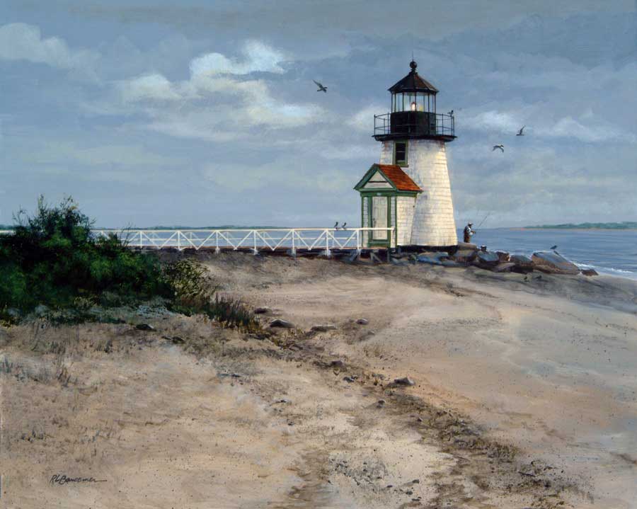
 Breaking down the composition of my paintings into thirds is a guideline I follow almost instinctively. Here's an example. Had the lighthouse been in the center and the horizon in the middle, this painting would not be nearly as interesting. Since I feature the rocks instead of the sky, the horizon was painted high on the painting. If I was going to feature some clouds I would have moved my horizon line to the lower third of the canvas. It doesn't always hold true but it's a good guideline to be aware of when composing your painting or photograph.
 View more of my lighthouse paintings
Give til it hurts.
Like every other artist, I recieve cordial invitations weekly to donate artwork to good causes so they can auction it off at a fraction of what I would otherwise charge. Today I got the best letter I've received in months. It stated, "Would you want your artwork featured, along with a Peter Max original, during the art, wine, and food fest?"
That's like asking me if I want my piece of art I took possibly a week to create totally upstaged by mega-media-whore Peter Max. What are these people thinking! I've seen Peter Max in action and his "people" (Public Relation handlers) don't like any other artists near him in fear of getting to close to his spotlight when the media is present (not that we'd want to or could) and they ask the media not to video him from behind because he doesn't like his public to notice his bald spot. Geez! When are these local beggers of art going promote in earnest the artists in their own community instead of using us as a side show for their featured act?
That's like asking me if I want my piece of art I took possibly a week to create totally upstaged by mega-media-whore Peter Max. What are these people thinking! I've seen Peter Max in action and his "people" (Public Relation handlers) don't like any other artists near him in fear of getting to close to his spotlight when the media is present (not that we'd want to or could) and they ask the media not to video him from behind because he doesn't like his public to notice his bald spot. Geez! When are these local beggers of art going promote in earnest the artists in their own community instead of using us as a side show for their featured act?
Friday, February 16, 2007
Fame
If you're a young artist with dreams of becoming famous, (like I once was) know that fame comes by being connected and not necessarily by being a good artist. As you get older, the dreams of fame become less important but the passion for painting can remain a strong and powerful force in your life. One that will be much more fulfilling than fame.
Tuesday, January 23, 2007
Coating your paintings

I have used a number of sprays to coat my acrylic paintings. For several years I've used Krylon Crystal Clear and have a friend who's been using it for a decade. I buy it at Kmart for $2.95 a can. The Golden varnish was purchased at an art store. It cost $17.99. I wouldn't use Krylon just to save money at the expense of good results but in my opinion it does as good or better job than the expensive stuff.
Pure White
I seldom use pure white in my paintings. Using a bit of yellow or yellow ochre in my white will give it a life that pure white lacks. If the painting calls for a cool white, I add a little cerulean blue to it.
Sunday, January 21, 2007
Composing in the camera
When I take photographs, I try to compose my subjects the best I can in the lens then back in the studio, half the difficulty in painting has been resolved. I find it much better than struggling to rearrange a composition that wasn't quite right in the photo. With a good photograph I'll more likely end up with a good painting.
I sometimes capture a still image from my video cameras as well. I've been able to capture images that are quite suffecient to use as reference.
I sometimes capture a still image from my video cameras as well. I've been able to capture images that are quite suffecient to use as reference.
Using your monitor
Try using your monitor placed near your easel or drawing board to view your reference photos. It's much better than a print out and with many viewing programs (I use ACDsee) you can zoom in your subject to see the details.

Sunday, January 14, 2007
Looking at things differently

Artists may see things more clearly than others but only in certain respects. An artist looks at a sailboat and sees how the water reflects up on the hull or how the sails catch the light and shadows. The yachtsman sees the same boat and sees none of those things but may observe how well the hull is cutting or dragging through the waves and how the sails are trimmed.

We are all blind to those things that do not interest us.
Perspective and Clouds

Often artist don't think about clouds in relation to perspective and although clouds sometimes seem random, they too follow rules. While at the port in Tampa today I took this photo which shows their perspective. Not all formations will be so obvious but a perspective always exists. Often it is most noticeable closer to the horizon.
Tuesday, January 09, 2007
Reflections in Water

Here is a rule that comes in handy when painting reflections on the water. Light objects reflect darker and dark objects make a reflection that is lighter. As you can see from this photo, the white boat casts a darker reflection in the water and the dark motor reflects lighter in the water. Don't ask me why but its always that way.
I have made an 11 minute video on the subject of waves and water. Click here
You can see a list of my other videos HERE.
Friday, January 05, 2007
Pitfalls of using photographs by others
 The painting (above) was done using photograhs that I didn't take. I seldom resort to that but occassionally there is no option but doing so poses certain problems. Not because of a lawsuit as my painting ends up far from being close to the photograph. The problem comes with lack of information even with a good photo seems to provide. Here is an example.
The first picture (below) shows the rocks but gave me no indication of where they jutted in and out. I assumed they didn't have much direction at all. I started the painting using the first photo and then found this second photo which defined the crevises with light and shadow more clearly. Had I actually been at the lighthouse (wish I could) even for a minute I would have grasped and understood the topography that the first photo simply didn't express.


So, even if you work from photographs, doing so from your own photos will result in a much clearer undertsanding of what you are trying to portray. It only takes a moment for those important features to stick in your mind when you take your own pictures.
Keeping your acrylics from drying out


As I'm sure you know, acrylics dry quickly. Sometimes too quickly. Your half hour break for lunch will find a palette full of unusable dry paint when you return. A simple box (I built mine with a clear acrylic top) will keep your paints wet even overnight. Just give the top of the lid as well as the paints a squirt of water from a spray bottle when covering your paints.
Another commercial method to keep paints wet is to purchase "Masterson's Sta-Wet Palette". With this you use the wet sponge and a special paper palette. It will keep acrylic paints very wet for many days.

Thursday, January 04, 2007
More than paint on canvas

Painting a landscape is not about putting paint on canvas, it is the process of continually and attentively absorbing the visual world with a caring eye in a way that others take for granted.
Friday, December 29, 2006
See more, express less
A good artist will see more and express less. Therein lies the power of a good painting. A complex landscape in the country has thousands of elements to consider; trees, limbs, leaves, grass, clouds, shadows, colors, values, and on and on. The artist takes this myriad of overwhelming information and expresses it clearly in simple terms so it can be more fully grasped in its essence.
Web sites and your artwork
The only way I know to sell your paintings or prints on the internet is to have a niche market for your work. I paint many different subjects. In the summer when I'm in my studio in the North Carolina I do landscapes of the Blue Ridge mountains, barns, etc. The problem is that no one knows how to look for such a thing on the web because it's such a broad subject. Now if I were to feature paintings of Mount Mitchell and someone was trying to find a painting of Mount Mitchell, then a search would be able to find my niche. Otherwise it's lost in a sea of general ties.
I've done two books on lighthouses and just by accident, I found a niche market for lighthouse prints. The important thing to know is that people who order lighthouse prints are not interested in buying a print of a lighthouse. They are interested in buying a print of a particular lighthouse because it has personal meaning to them. Any lighthouse won't do. On my website www.bansemer.com I feature lighthouses and when someone is looking for a print of the "Morris Island Lighthouse", well, I just happen to have it and it's easy to find. It's the only way I know of so far to be successful on the web. I suppose there might be a niche for "fantasy lighthouses" as well. In any case, generalities don't work well if you are trying to promote your work. Be specific.
(Pictured is a painting I did of the Brandt Point lighthouse in Nantucket)
Hesitation makes for weak paintings
You can be sure that a painting that inspires us was done by an artist sure of him/herself and not one that hesitates. Most good paintings display brushstrokes that are deliberate, strong, and know where they are going. It is a very difficult thing to do. Study those who have mastered it and see how much they convey in a powerful and well placed stroke.
Wednesday, November 29, 2006
Seascape Painting
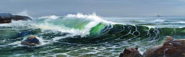
The painting of most subjects can be learned by looking at subject itself. One exception is the painting of seascapes. That can often be learned best by looking at someones work who paints seascapes well rather than sitting and looking at real waves crashing on the beach.
Subscribe to:
Posts (Atom)